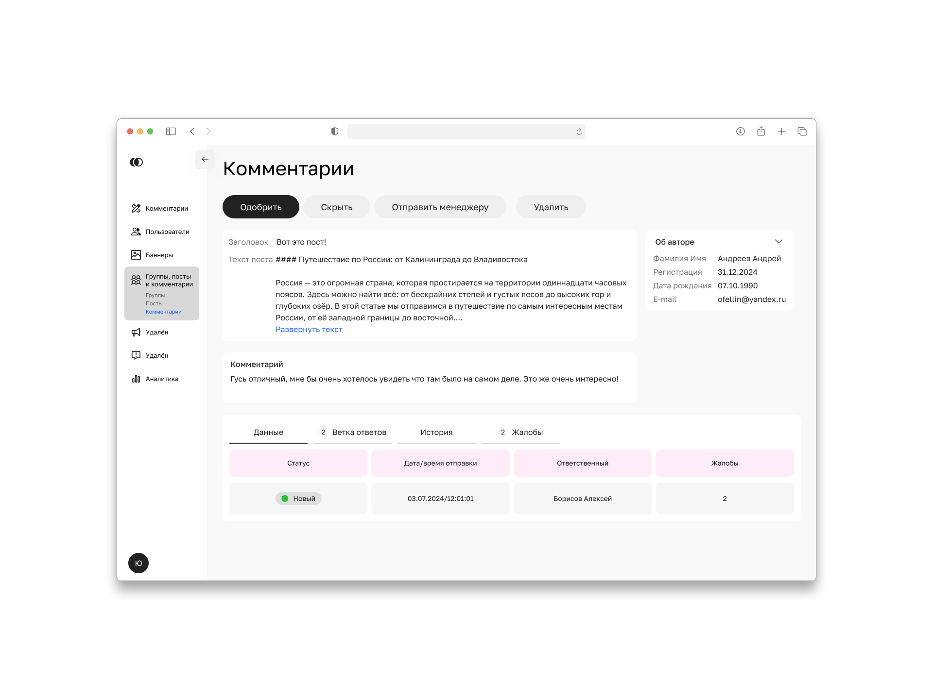
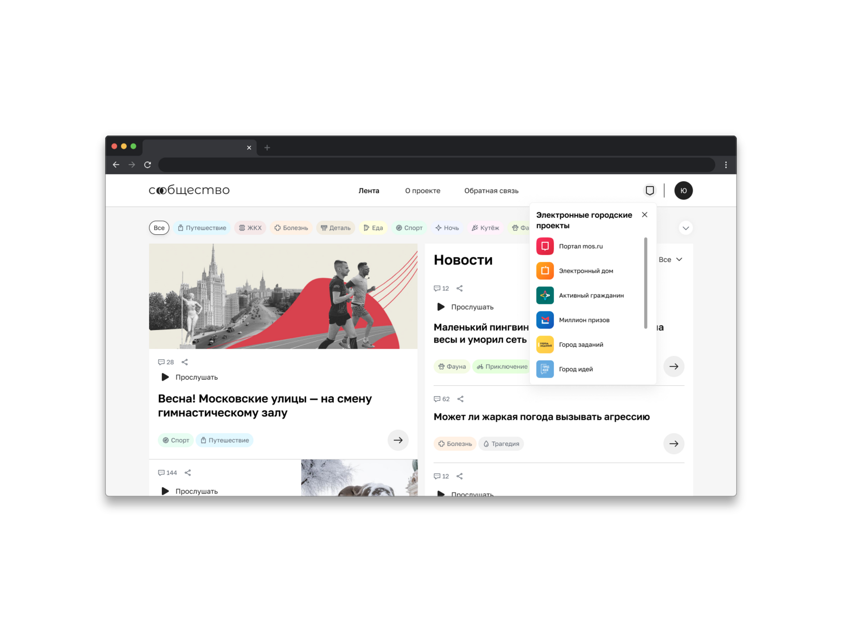
A moderator dashboard for Community, Moscow’s city-stories platform: comments, users, publications, groups and posts in a single flow.
Community kept growing, and so did the stream of content, yet a single administrator sorted through all of it inside the general admin panel. I split the moderator out as a separate role and built them a workspace of their own: one mechanism for every entity, plus inline review straight from the list. Checked it in moderated usability testing: 8 moderators, 2 prototypes. Time on the target task went down, and the moderator’s nerves stayed intact.
UX design
Research
Prototype
Usability test
B2B
01Context and problem
Community grew faster than one admin could keep up
The city-stories platform on Mos.ru, Moscow’s city services portal, took off, and with it the stream of user content: comments, publications, complaints. All of it landed on a single administrator, who dug through the backlog in the same admin panel that ran everything else.
The task wasn’t “add a ban button”. It was to split the moderator out as a separate role and give it a workspace built for mixed entities: comments, users, publications, groups, posts. With one way of handling all of them, not five different ones.
02Role
What I designed and who I checked it with
My part
a
Research: took apart the existing admin panel and functional references, formed hypotheses and ran moderated usability testing.
b
Mock-ups and prototype: designed the interaction logic and UI elements of the dashboard, building on the existing admin panel.
c
One mechanism: set up a single pattern for how a moderator handles every entity type, so new sections plug into the same scheme.
d
Room to grow: worked out the logic and mock-ups for the remaining entities ahead of time.
Working with the team
a
Sasha (analyst): wrote the functional requirements, i.e. what the dashboard must be able to do. I turned them into screens and scenarios.
b
Engineering: interviewed the developers to learn the constraints: what could really be built into the existing system and what would slide into the backlog. Cheaper to find out before the mock-ups than after.
c
Parent product: the dashboard is a direct sequel to the Community case study (the Moscow city stories platform). The shared moderation queue I laid down there grew into a dedicated workspace here.
03Solution
Decisions that cut steps for the moderator
3.1A registry sorted by status
What I found
In the general admin panel, comments landed in one big pile. Moderators couldn’t tell what to grab first.
What I did
Built a registry with statuses: “Awaiting review”, “Reviewed”, “Unwanted”, “Reported”, “Sent to manager”. Every comment knows its place.
Effect
In testing, moderators found the right group of comments on the first try. The queue stopped being a dumping ground.
3.2Quick verdicts right in the registry
What I found
Short, clear-cut comments (“thanks”, obvious spam) need no investigation, but the old flow made you open a card for every single one.
What I did
Moved the verdict into the registry itself: the obvious gets closed without diving into a card. One click instead of five.
Effect
Most of the time saved on the target task came from here. Routine stopped costing page jumps.
3.3A rich card for the tricky cases
What I found
For a disputed comment, the moderator lacked context and had to dig up the original post and the author’s history by hand.
What I did
Put everything into the card at once: the original post, a short author profile with karma, the reply thread, the comment’s moderation history and reports. Plus sorting by most popular and by low-karma users.
Effect
A tricky comment gets decided on one screen, no digging through sections.
3.4One mechanism for every entity
One action pattern for comments, users, publications, groups and posts.
Shared statuses and rejection reasons, so moderators don’t relearn the tool for each section.
A new entity type plugs into the same scheme, no reinventing the interface.
EffectModerators learn the dashboard once, and the product grows sideways without new UX for every section.
04Validation
Two prototypes, eight moderators, one winner
I built two prototypes around opposite bets and gave them to eight people who actually moderate content for a living. Prototype 1: a rich card with context (seven hypotheses). Prototype 2: quick verdicts right in the registry (three hypotheses). Moderated testing settled it.
1
“I want to see the comments that need a verdict straight away, so I don’t waste time.” Prototype 2
2
“A short, clear-cut comment I want to rate right in the registry, without opening a page.” Prototype 2
3
“A disputed one needs context: the post, the author, the reply thread and reports, all on one screen.” Prototype 1
I measured three things: effectiveness (did they reach the goal and in how many steps), efficiency (time, errors, hesitations) and satisfaction on a 1–5 scale. The winner wasn’t either-or but a combo: a registry with quick verdicts for routine plus a rich card for the tricky cases.
Mock-upComment registry sorted by status: “Awaiting”, “Reviewed”, “Unwanted”, “Reported”.Mock-upComment card: post context, author and karma, reply thread.
One mechanism for 5 entity typesComments · users · publications · groups · posts. One logic for all.
05Outcome
Fewer steps, less time per task
−38%Scenario stepsThe target task got a third shorter.
−32%Time per taskMostly thanks to verdicts in the registry.
4.3of 5SatisfactionModerators’ score in testing.
5typesEntities, one mechanismComments, users, publications, groups, posts.
+
Scenario steps: the target task, moderating a comment, got roughly a third shorter in steps, mostly thanks to verdicts right in the registry.
+
Moderator peace of mind: the winning prototype scored 4.3 out of 5; the top praise was “you don’t have to dive in anywhere”.
This is a prototype research result, not a production metric: the dashboard went into development based on these mock-ups.
06Next steps
Built to grow: the other entities are already mapped out
Entity
Users
A user card with karma and violation history: moderate not just comments but the people behind them.
Entities
Publications and groups
The same statuses and one mechanism for publications, groups and posts. The scheme is mapped out; what’s left is laying it out on screens.
Handoff
Handoff to engineering
Logic and elements are designed so developers can assemble the dashboard piece by piece without asking about every screen.