Designed Moscow's city-stories platform and shipped it to production: stories.mos.ru
In two years, Moscow's lifestyle media had shut down one after another, and the city had nothing left to engage residents with. I built a product with user-generated content and moderation for Mos.ru, the Moscow city services portal: from zero to MVP in nine months. The first three months: 169.4K views, 26.25% bounce rate, CSI 78.9%.
Product/UX design
IA
Design system
Prototype
MVP launch
01Context and problem
The city was losing a place for residents' voices
Over two years, many lifestyle and city media outlets closed down. What was left in the news feed was politics and economics. Moscow had no place where a resident does more than read: shares a story, comments, argues.
I took the job not as “draw a website” but as “raise engagement”. The catch: content comes from two sources at once, the editorial team and the users, and all of it goes through moderation.
02Role
What I did and who I had to win over
My part
a
Research and architecture: took apart several competing services, built a user portrait, laid out the section structure and the behaviour logic.
b
UX/UI and the prototype for the whole platform.
c
A design system from scratch: type, colour, components.
d
Took the product to MVP and shipped it to production.
Working with the team
a
Stakeholders: aligned the goals at kick-off: we’re not building a news shop window, we’re building a place where residents take part in city life. That set the MVP scope (feed, stories, comments; no groups or events yet) and the metrics we watched after launch.
b
Editorial and moderation: designed one publishing flow for two sources. Editorial pieces and residents’ stories go through a shared moderation queue with statuses and rejection reasons. That loop later grew into its own case study, “Moderator Dashboard”.
c
Development: the design system, with every component state, was built separately from the one Mos.ru already used. I handed off mock-ups in stages, release by release, and the expensive ideas like multi-touch search and podcasts honestly went to the roadmap backlog. That’s how the MVP shipped sooner.
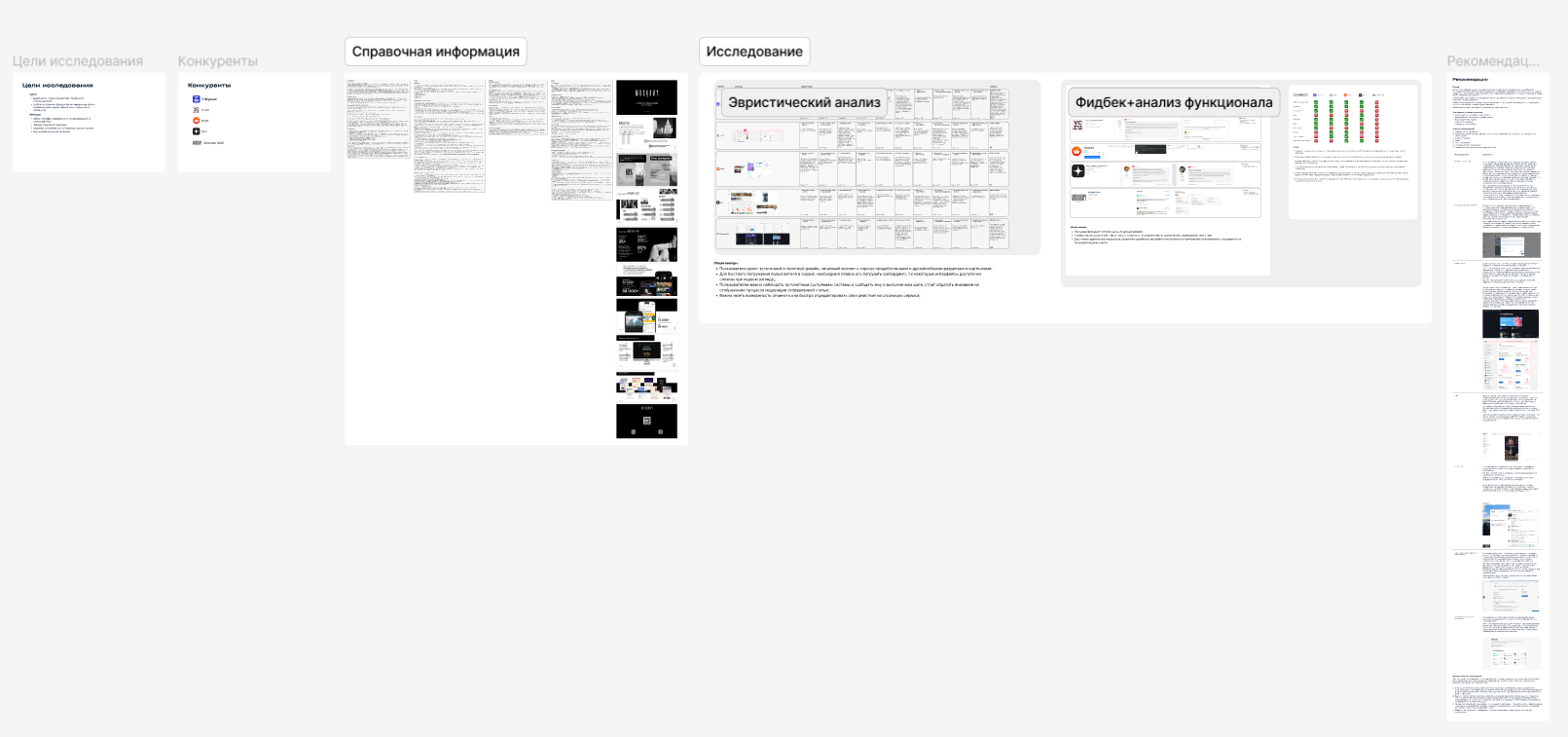
Research board: goals, competitors, heuristics, feedback.
03Solution
Key decisions and why they worked
3.1One logic for every action
What I found
Competitors put follow and unfollow on different screens, and users get lost.
What I did
Turned it into one predictable pattern across the whole platform.
Impact
Fewer slip-ups on the way in: in usability runs, nine out of ten participants followed and unfollowed on the first try.
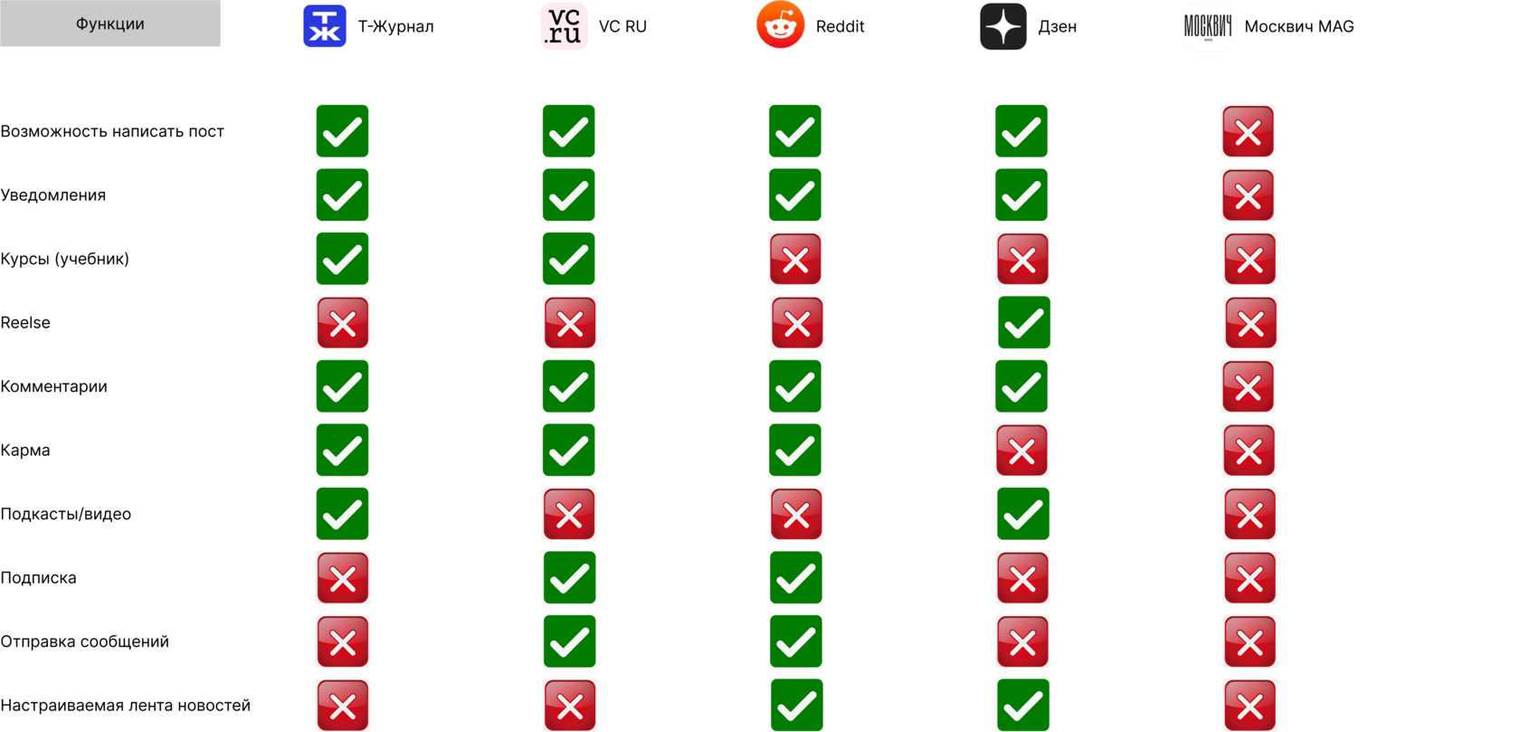
A handful of key competitors, eleven features. Green ticks show what people expect as basics, red shows where the market has room to grow.
3.2Betting on posts and comments
What I found
Writing a post and discussing it in the comments is the core engagement driver in services like this.
What I did
Made it the heart of the interface, not a side feature.
Impact
The first residents’ stories arrived in week one; in three months 250+ user stories passed moderation, with about 3K comments under the pieces.
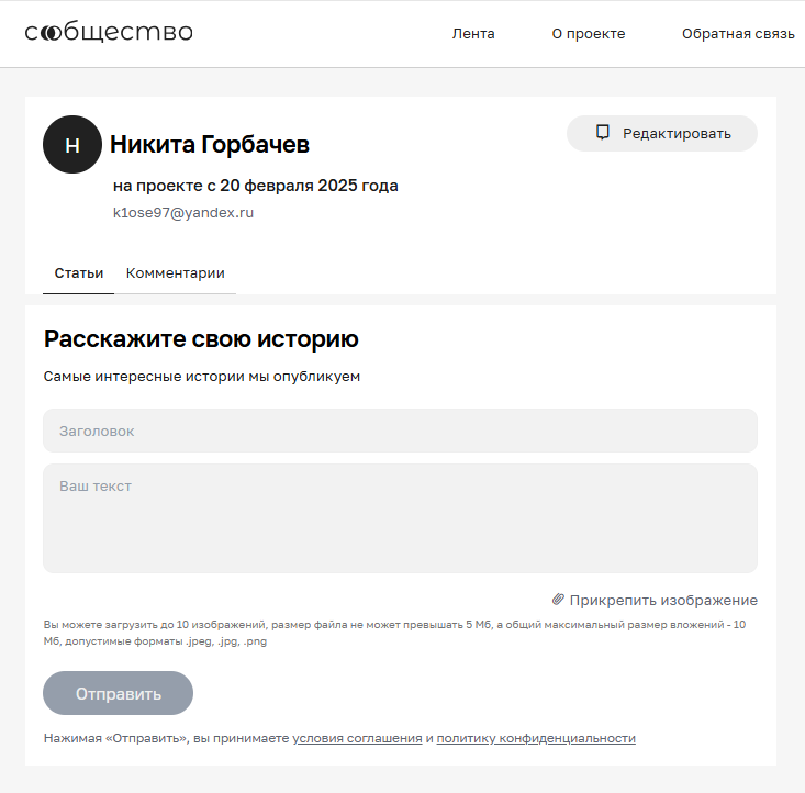
The “Tell your story” form: title, text, up to ten images, and off it goes to moderation.
3.3Caring for the older audience (24–35 and 55+)
What I found
Some people struggle with complex filters and a crowded interface.
What I did
Minimalism, hints and pop-ups, plain language, familiar gestures.
Impact
Kept both age groups on board: in the satisfaction survey (CSI 78.9%) the older audience rated navigation as easy as the younger one did.
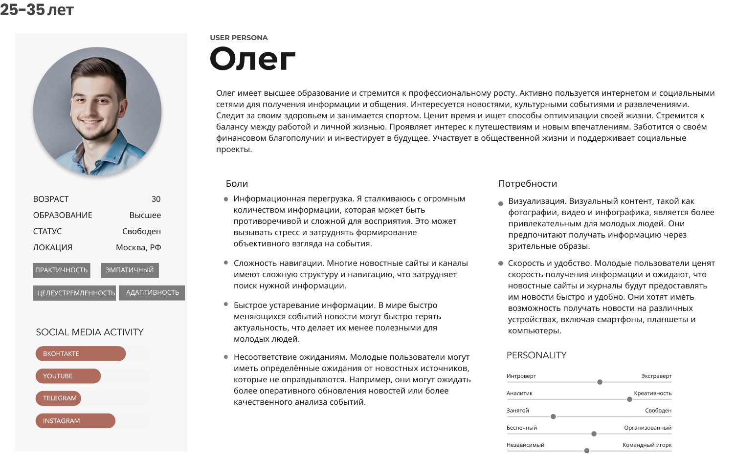
Oleg, 30: tired of info noise, wants simpler navigation. Turns out most people in the research were a bit like Oleg.
3.4A design system for a text-heavy city product
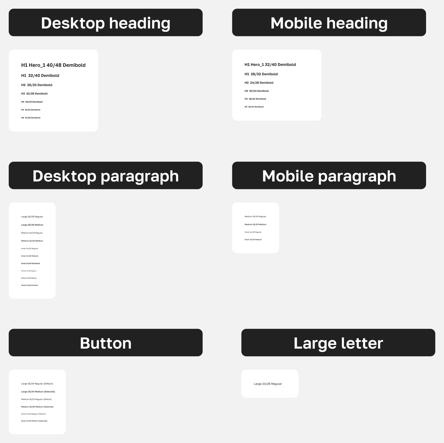
Golos Text is made for screens: it reads well at small sizes, its calm contrast doesn’t tire you on long texts, and it feels neutral and right for a public-sector project.
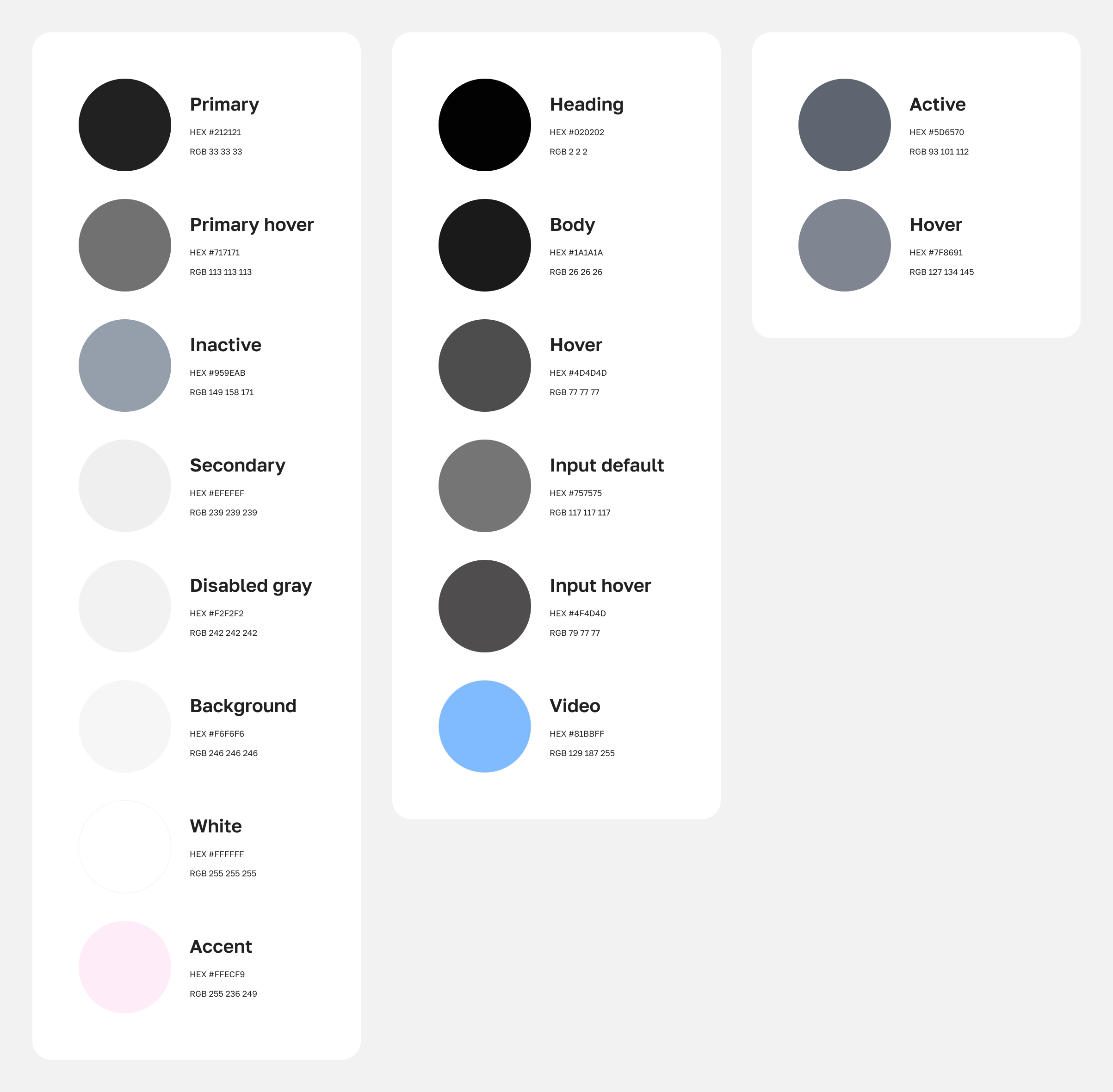
Black builds trust and is easier on the eyes in long reads.
A soft pink accent (#FFECF9) adds lightness and a sense of care.
ImpactA calm, consistent interface that’s comfortable to read for a long time. Hence the low bounce and high CSI.
A type scale built for long reads: from the hero heading down to captions.Palette: calm black, hard-working greys and a single pink accent.
04MVP
Shipped and started measuring
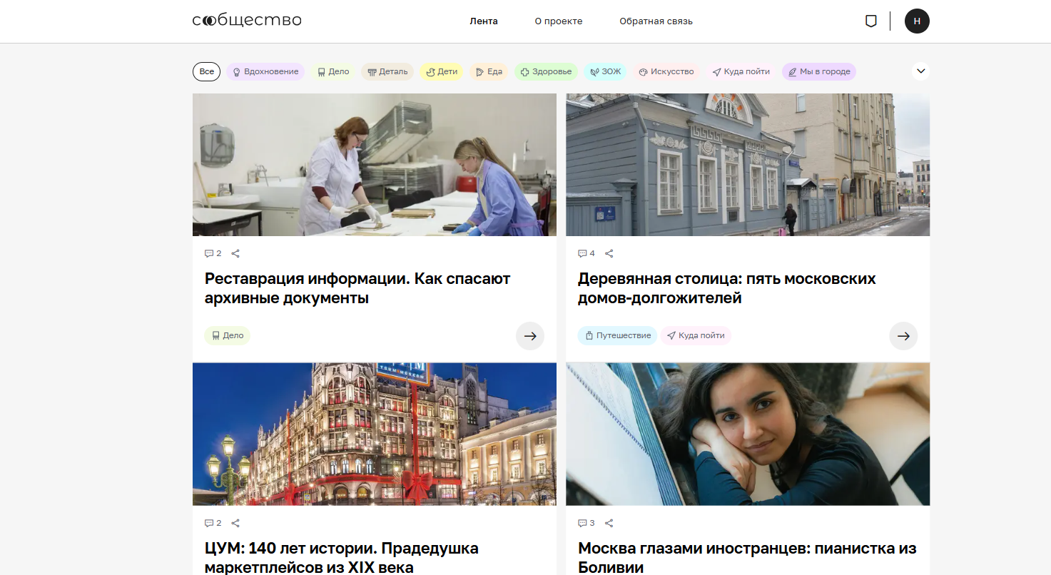
A few months in, we launched the pilot on the live project, stories.mos.ru, and started watching views, bounce, CSI and time on site.
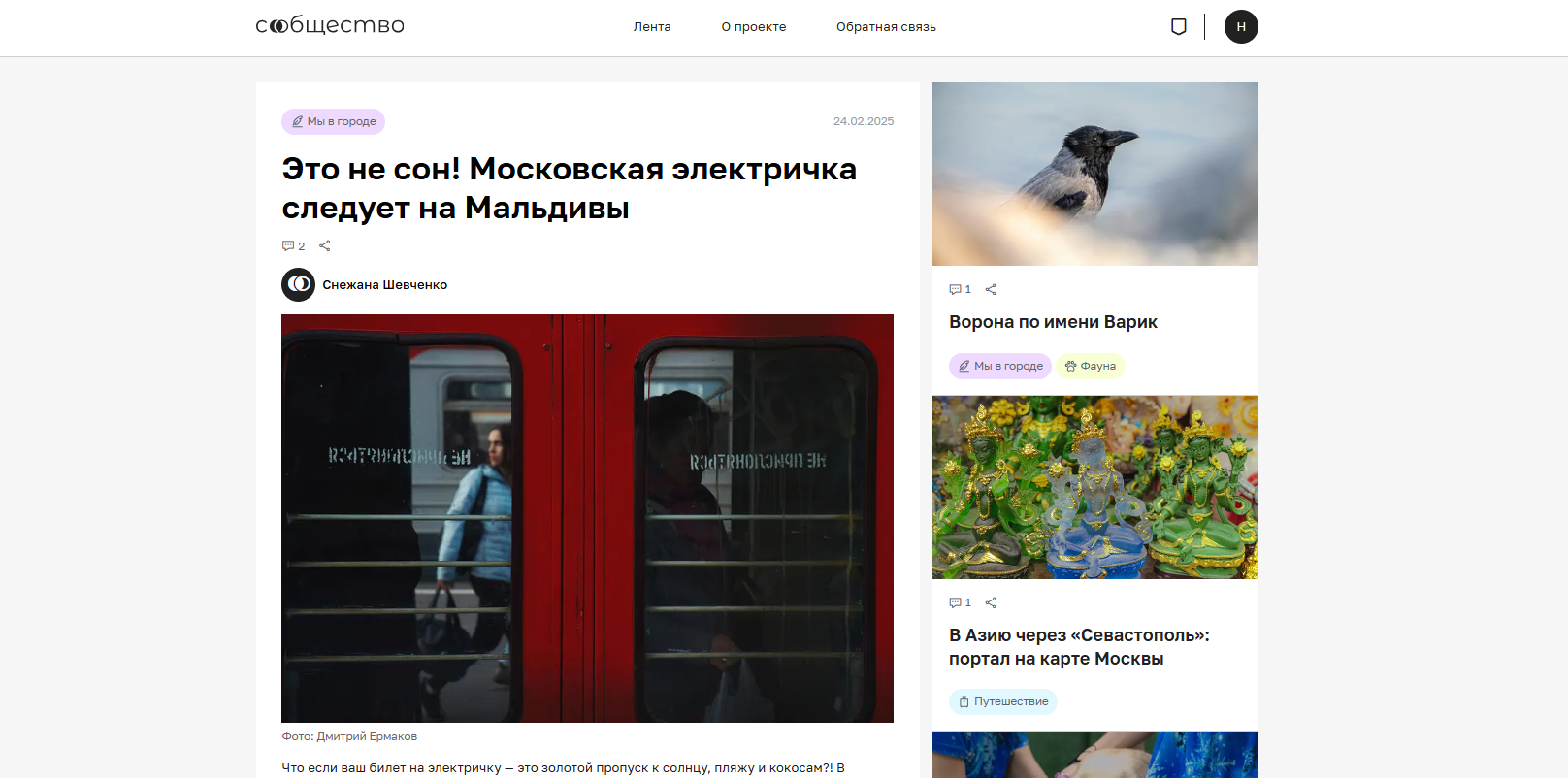
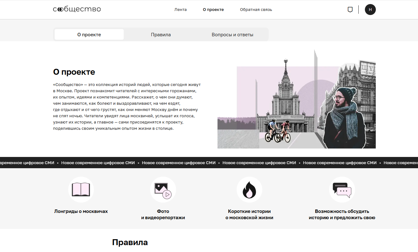
Mock-upPilot feed: editorial pieces and user stories in one stream.Mock-upStory page: tags, authors and related pieces close at hand.Mock-up“About”: the manifesto and the product’s signature ticker.Mock-upFeedback: tech support and ideas in one window, socials right next to them.
05Outcome
The first three months after MVP
169.4KViewsFrom zero, for a brand-new city product.
26.25%Bounce RateLow: people stay and read.
78.9%CSIUsers are happy.
24–35 and 55+AudienceReached both target groups.
+
Time on site: 3 min 20 s per visit on average. That’s one or two pieces read in full per session, not a skim of the headlines.
+
Engagement: 250+ residents’ stories and ~3K comments in three months; roughly one reader in four comes back within a week. Right on target for “not just reading, but taking part”.
The numbers are decent, not dazzling: there’s still plenty of room to grow and improve the service.
06Next steps
These are plans, not results, so I’ll keep it short
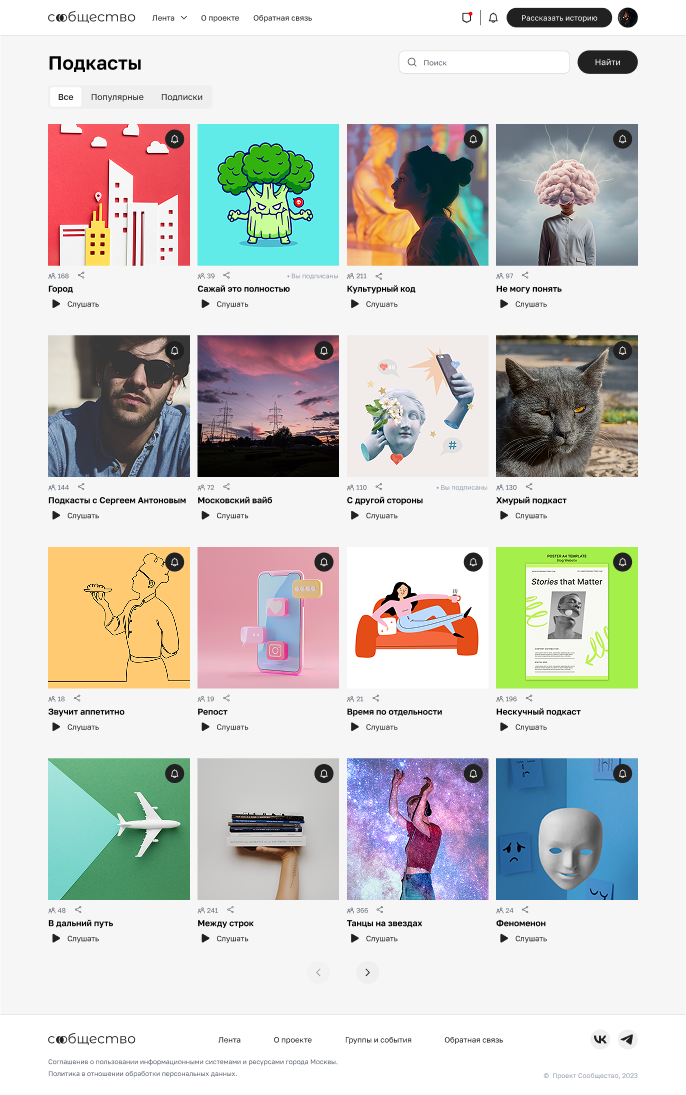
Podcasts
Another way to take in content, on the go or while doing chores. Voice adds emotion, and transcripts bring in search traffic.
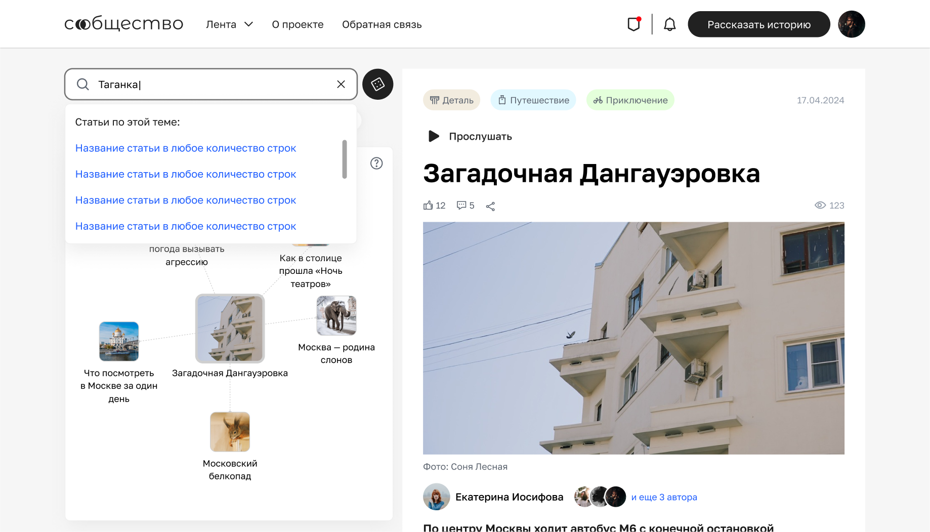
Connected search
A resident searches for “road repairs” and sees not just news, but neighbours’ discussions, the city’s plans and a how-to for filing a request.
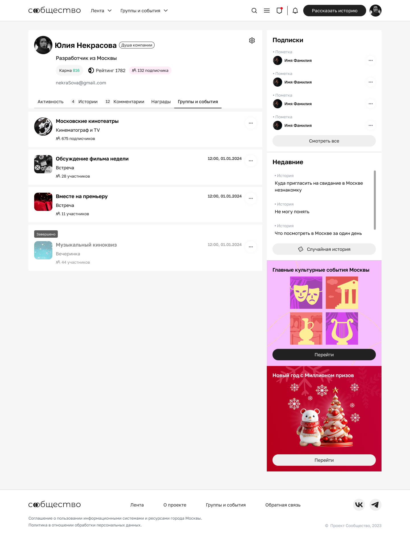
Gamified profile
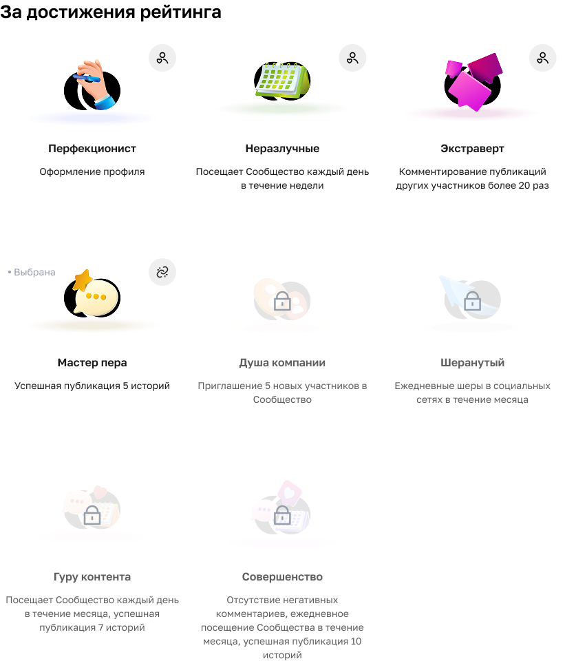
Activity, badges, ratings. Gives people a sense of their own place on the site and brings them back more often.
Rewards system: from “Perfectionist” for completing your profile to “Content Guru” for ten stories.