Pulled AI agent risk assessment out of email threads and Excel into a single registry
Agent versions changed almost daily, while the risk assessment lived in Jira tickets, Excel exports and archives people forwarded to each other.
I removed six manual hand-offs from the assessment route (the before / after process map shows them) by moving document collection and the risk draft inside the product. The agent, its versions, thirteen risk types and the verdicts of four departments now live in one place, and everyone involved can see a version travel from “new” to “approved”.
Enterprise
AI / ML
Risk management
Web
Product
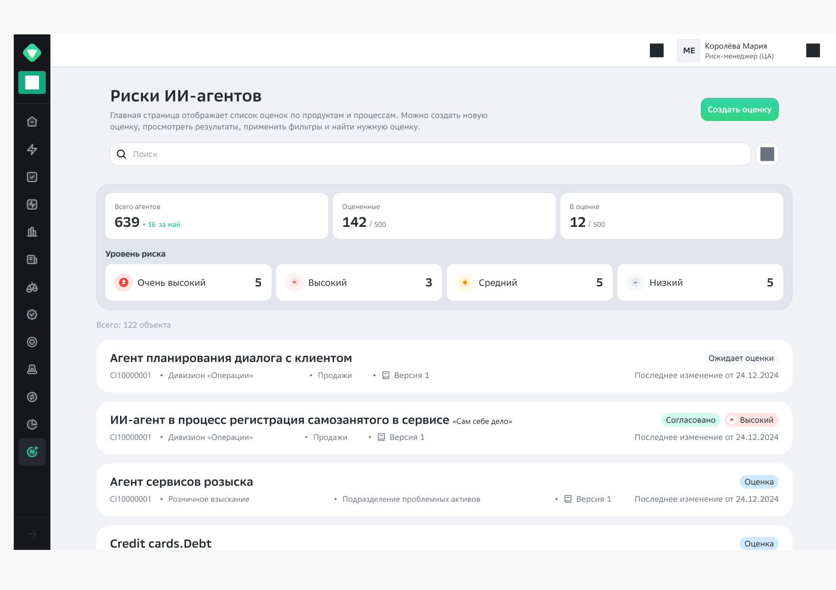
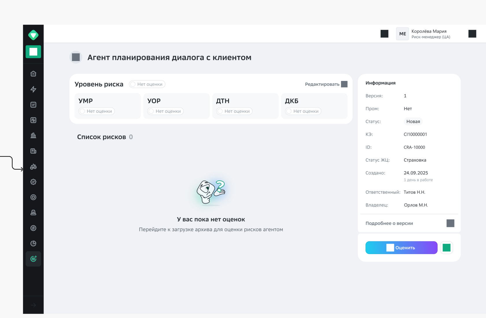
AI agent registryScreenAI agent registry: the summary on top answers “how many in total and how many are done”, the list answers “what to do next”.Agent cardScreenAgent card before assessment: empty, but you can see what is missing.
6 manual hand-offs → 0That is how many times the work changed hands before the assessment even started. Now the whole route runs inside the product.
01Context and brief
Hundreds of agents, every check done by hand
An AI agent inside Sber, Russia’s largest bank, isn’t a chatbot on a website. It’s an employee: it registers self-employed clients, plans a conversation with a customer, tracks down debtors. Each one has a version, an owner, a person in charge, a lifecycle status and a configuration item in the shared systems catalogue. And each one carries risks ordinary software never had: direct and data-borne prompt injections, supply-chain vulnerabilities in the models, decisions that affect each other across one shared landscape, an AI platform going down.
Risk for an agent like that isn’t assessed by one person in one sitting: four departments each give their own opinion, and it all rolls up into an integrated score. While there are only a few agents, this lives quietly in email threads. Once there are many, and versions update almost daily, email runs out, and shipping AI to production hits the ceiling along with it.
Where the brief came from
The brief came from risk-function stakeholders, and it arrived as a symptom, not a solution: the number of agents had grown noticeably, versions updated almost daily, each had thirteen problem areas, and nobody could quickly say how ready and working a given version was. Nobody asked for “build a registry”. What they said was “we can’t keep up and we can’t see the big picture”.
No process diagram existed in any form. No flowchart, no write-up. Just the policy in one place, tasks in the tracker in another, and people holding the connection between them in their heads.
Who’s involved
a
Assessment process owner makes sure no agent reaches production unassessed, and that assessment doesn’t become the emergency brake for all AI in the bank.
b
Risk manager walks the route by hand. What they need is to stop building archives and forwarding files so they can do the actual assessment.
c
Four approving departments each look at risk from their own angle and at their own pace. They need to see exactly what they’re assessing without asking again.
d
Agent owners are the people shipping these versions. For them assessment is an outside procedure, and they need to know which step it’s on and when it’ll be done.
Constraints I had to work with
1
Auditability. It’s a regulated process: every decision has to leave a trail of who, when and on what grounds. Not a wish, but the frame the design has to fit inside.
2
The bank’s design system. No reinventing components: the closer to existing patterns, the cheaper the build and the less users have to learn.
3
Stream of changes. Agent versions change almost every day, so the interface has to survive that stream, not fall apart under it.
4
No process diagram. I had to design while we were still figuring out what was actually going on. Discovery and design didn’t run one after the other; they overlapped.
My role
I was the only product designer. That meant discovery, the process map, information architecture, every screen with its states, and defending decisions in front of stakeholders. Engineering, analytics and risk methodology came from the team.
02How I approached it
Process first, screens second
The domain was new to me, the vocabulary foreign, and the users busy with their own jobs and not keen to explain them a third time. The most expensive move in that situation is to start drawing before you understand who hands what to whom. So the first artefact was a process map, and the screen grid grew out of it.
Choosing a method
I went with a role-based process map instead of the usual user journey map. The reason is simple: the pain here doesn’t live on a screen, it lives in the seams between people. A user journey describes what one person does; here I needed to see where work changes hands and how long it sits idle in between. A classic CJM doesn’t show that. It draws one hero, and this route has four.
What I considered and dropped: going straight to a prototype and “testing it with users”. With two available stakeholders and no process diagram, a prototype test would have checked how usable the screens are, but not whether the route itself was right. Route first, then screens.
We worked in design sprints with a dedicated research column. A sprint beats open-ended iteration on exactly one thing: every iteration forces you to show results to the people who live in the process. In an unfamiliar domain that’s the only way not to drive far in the wrong direction. What sprints didn’t give me was depth: two weeks is too little to get your head around risk methodology, so there were several of them.
How I sliced the problem
The system broke down into four levels of nesting, from the list down to a single risk. That same decomposition set the order of work: until the bottom level is clear (what one risk is and what you can do with it), you can’t design the ones above. I didn’t get to that order right away. First I did it the other way round and had to redo it; the breakdown is in section 06.
Level 1RegistryAll agents and all assessments. This level answers “how many in total, how many done, what to grab first”. Hence the summary, filters, sorting and search.
Level 2Agent and its versionsA card with the version passport: owner, person in charge, lifecycle status, CI, attachments. The lifecycle lives here too: new → assessment → approval → approved, with branches for correction and reassessment.
Level 3Version’s risk listThirteen risk types with levels and rationales. This level lets the risk manager scan everything at once and spot what’s contentious.
Level 4A single riskLevel, rationale, assessments from four departments, “not applicable” status with a reason. The bottom level turned out to be the hardest: it’s where every contentious case in the process lives.
How we worked
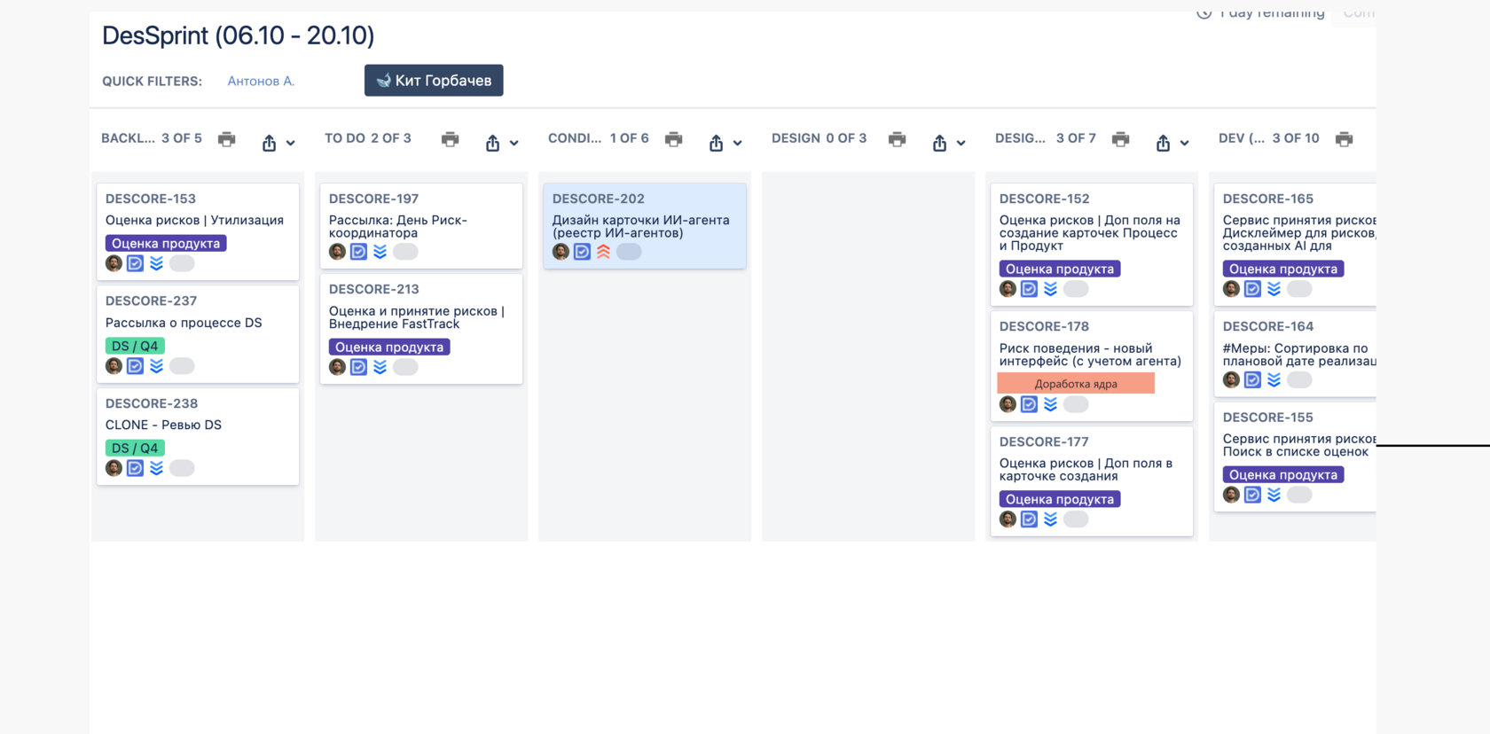
Two-week design sprints with a dedicated review column: no mock-up went to engineering until it had been looked at. The board below is one of those sprints: backlog on the left, what’s already gone to dev on the right.
Design sprint boardArtefactA two-week design sprint: a separate review column sits between “design” and “development”, so no mock-up goes to dev until it’s been looked at. On a phone the board scrolls sideways.
03Research
Four sources, because none was enough
Every source has its blind spot. Stakeholders describe the process as it was intended. Documents describe it as it’s regulated. Numbers show how it actually runs. Industry practice hints at what people generally do with AI risk. I gathered all four and looked for where they disagreed: a disagreement always means the process works differently somewhere than people think it does.
Source 01
Stakeholder interviews
How the process is meant to work · two people, many rounds
Only two people held the knowledge, so depth came from frequency, not headcount: I kept coming back with a new version of the process map and asking where I’d got it wrong. The key finding was that the expensive part of the route wasn’t where I expected. The risk assessment itself takes reasonable time; what eats it is preparing for assessment: gathering documents, waiting for an export, forwarding, waiting for an upload.
Source 02
Reconstruction from tracker tasks
How it runs in real life
There was no process diagram, so I pieced the route together from tracker tasks and checked it with stakeholders. That became the “before” user flow in section 04. A mismatch showed up immediately: in conversation the route was shorter than in the tasks. People simply didn’t count some steps as work: “it’s just two minutes to forward it”.
Source 03
Timing each step of the route
What it costs in time
Each handoff step cost twenty minutes or more, and the condensed route has six of them. And those minutes are active work; waiting piles up between steps while the next person notices, opens, approves. That ratio of work to waiting became the main argument for removing handoffs rather than speeding up screens.
Source 04
B2B benchmarks and heuristic review
What the industry does
I looked at how mature B2B risk management systems and complex internal registries are built: what goes into the overview, how faceted filters work, how the audit trail is shown. I took overview-first and a mandatory decision trail. I didn’t copy the overloaded tables with sorting on every column: for the user’s two real questions that’s just extra choice.
Side note
What to do when there’s no data
In an internal product, some decisions always have to be made without numbers: there are few users, analytics for a product that doesn’t exist yet don’t exist by definition, and there’s usually nothing left to measure “before” with after the fact. In those spots I don’t pretend the data is there.
What couldn’t be measured: how many versions never reach assessment at all, how long an approving department sits on a risk, how often an assessment gets sent back for rework. What I used instead were three props. A proxy metric: instead of the unmeasurable “how much we lose”, I counted manual handoffs in the route, because they’re observable and waiting time grows with them. An expert call with a written assumption: where there was no data at all, I wrote the assumption right into the decision, so people could challenge it instead of arguing with gut feelings. Testability after release: for every assumption I noted what would disprove it once the system starts collecting its own stats.
This is actually the most common situation in internal products. Pretty funnel dashboards almost never exist there, and working without them is a skill in its own right, not an excuse.
04User flow: before and after
Six manual handoffs versus one screen
I didn’t rebuild the old route from memory: it’s laid out step by step right on the project’s working board. Below it sits next to the new one, step for step. Red marks the places where work stopped and waited for a person.
BeforeJira, Excel, portal, archives, email
Risk managerGets an assessment task in JiraThere’s a task but no data for it: that still has to be gathered in the four steps below
AdministratorPulls an Excel export of agents from the systems catalogueManual export: it doesn’t exist until someone asks
AdministratorForwards the export to the internal portalHand-to-hand transfer, no trail left behind
Risk managerPacks the codebase and business requirements into an archiveDone by hand, with no way to check it’s complete
Risk managerForwards the archive to the portalAnother handoff, another wait
AdministratorUploads the agent and the versionBottleneck: everything hinges on one person
Six handoffs, two people busy just with preparation, each step twenty-plus minutes of active work plus waiting in between. And that’s the condensed version: in real life the route was longer.
AfterOne product from request to approval
Risk managerOpens the registry and sees the queueSummary on top: how many in total, assessed, in progress
Risk managerCreates an assessment and attaches the archive right in the cardUpload inside the product, no administrator, no forwarding
SystemBuilds the risk list from the documentsA draft assessment is ready before anyone starts working
Risk managerEdits levels and rationales, marks contentious ones “not applicable”The reason is recorded in the system, not in someone’s inbox
Four departmentsAdd their assessments in the same cardThe integrated score calculates itself
Head of unitApproves the versionStatus is visible to everyone in the registry, no need to ask
Both forwarding steps, the manual export, the manual archive packing and the go-between administrator role all dropped out of the route. What’s left is the work the process exists for: read, assess, justify.
05Decisions and why these ones
Every decision rests on a principle you can name out loud
In an internal product, “users are used to it” doesn’t fly: there are few users, their habits differ, and the people you argue with are methodologists and security. So every decision below has a “why” block with a named principle. You can check it, challenge it and reuse it on the next project, which you can’t do with “I just feel like it”.
5.1Summary above the list
What I found
The registry answered “what do we have”, but work starts with a different question: “what do I grab first”. To gauge the volume, the risk manager counted rows by eye every time.
What I did
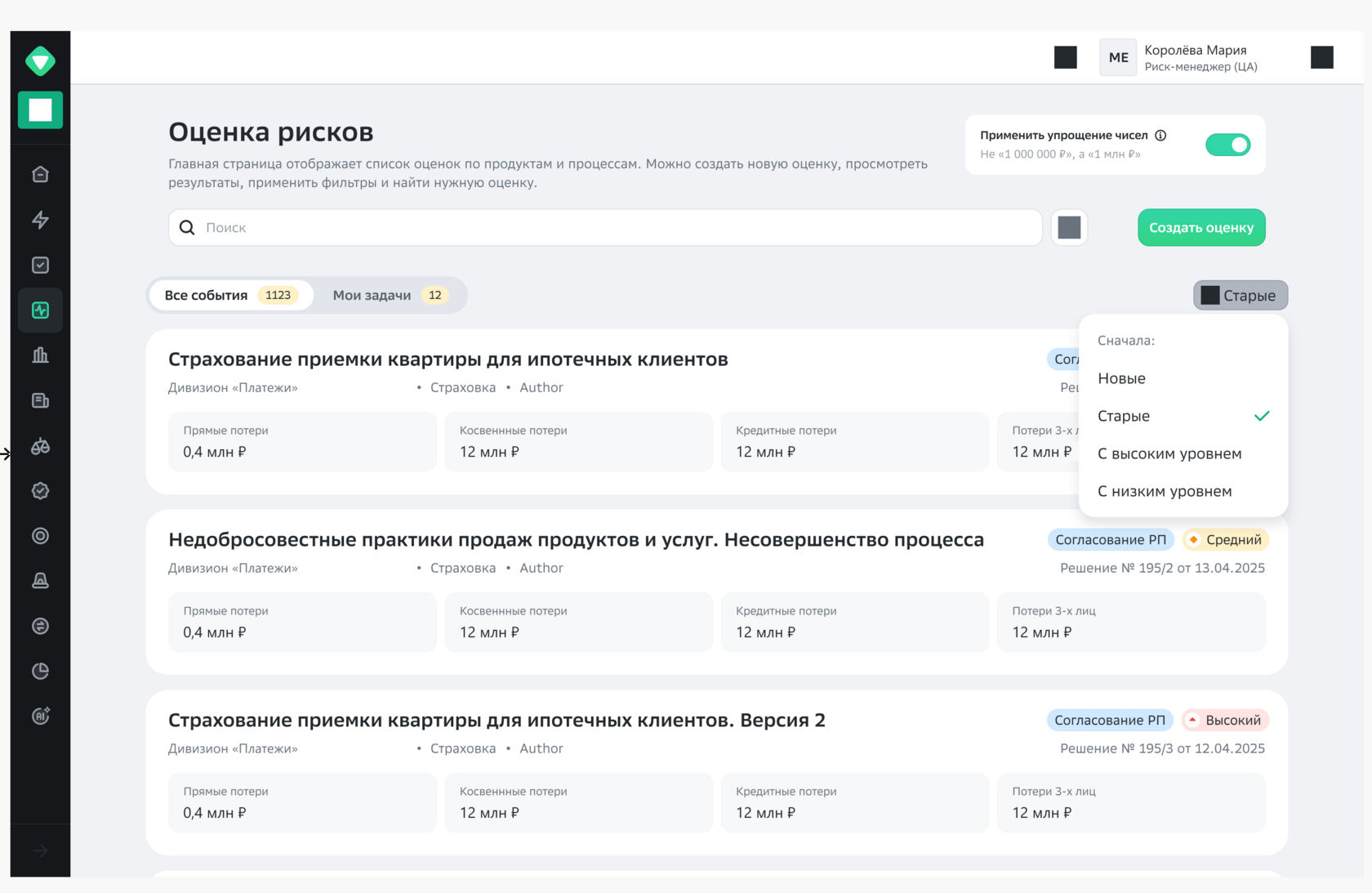
Four tiles above the list: total agents with month-over-month growth, assessed, in assessment, and a separate row broken down by risk level. The list below now answers “what to do”, not “how are things”.
Impact
Getting to work starts with an answer, not a recount. As a bonus, the summary became something you can show a manager without opening anything else.
WhyShneiderman’s mantra for data-heavy interfaces: overview first, zoom and filter, then details on demand. A registry without a summary makes people count by eye what the system knows exactly.
5.2Filter: two options, one chosen
What I found
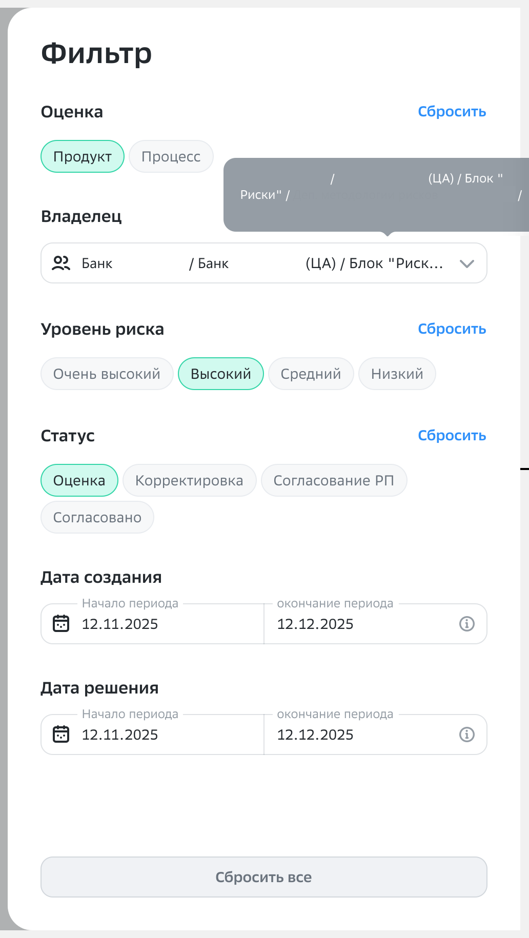
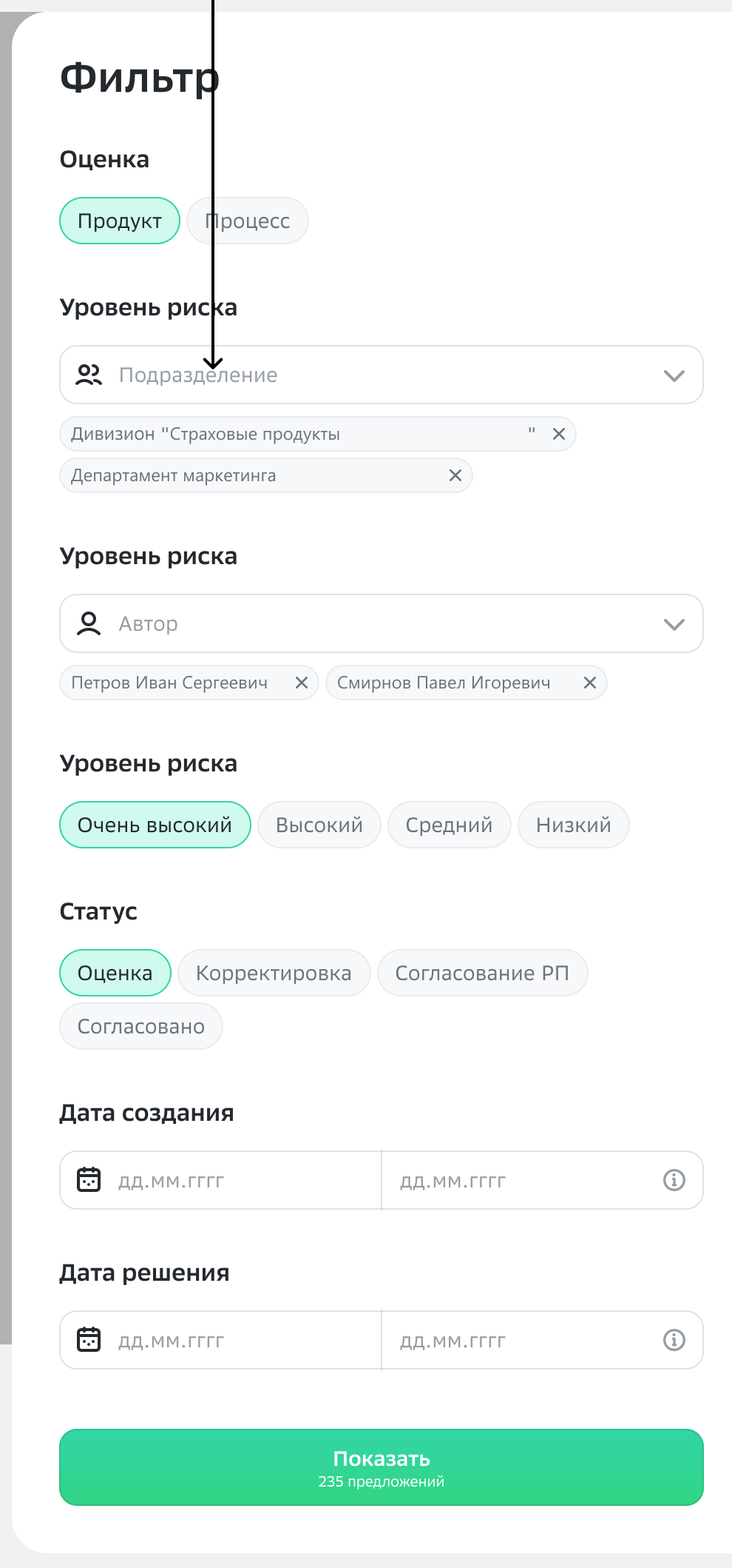
There are a lot of fields to filter by: assessment type, owning department, risk level, status and two date ranges. There’s no room on screen for them, and people pick filter sets blind, without knowing in advance what they’ll find.
What I did
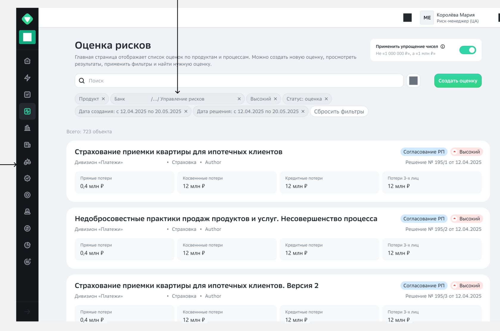
I designed two options and presented them side by side. Option 1: a side panel on the right, filters apply as you fill them in, applied values show up as chips on the main screen and can be removed one by one. Option 2: multi-select inside the panel and a “Show 235 results” button: the result is counted but not shown until you press it.
What we picked
Option 1. The second one stayed in the backlog of ideas for later, not because it’s bad, but because it solves a different problem.
WhyAuto-apply wins when results come back fast and people build their filter set blind: they see the result of each step and don’t waste attempts. A “Show” button fits when the query is expensive, or when there are many filters and people set them deliberately. Chips for applied values on the main screen follow straight from Nielsen’s “recognition rather than recall” heuristic: filter state is visible without opening the panel, and you remove it right where you see it.
5.3Number simplification toggle
What I found
Every card in the registry has four loss amounts. Across ten cards that’s forty numbers on screen, all accurate to the ruble, while at that moment people are only comparing them with each other.
What I did
A switch in the header: “1M ₽ instead of 1,000,000 ₽”. On, and loss amounts across all cards read as orders of magnitude; off, and they show exact figures.
Impact
The list became something you scan, not proofread. Precision didn’t go anywhere: it’s one click away, right where it’s actually needed.
WhyA number in a list and a number in a report have different jobs. With dozens of cards and four amounts each, exact figures are noise: the eye compares orders of magnitude, not rubles. But you can’t take precision away, it’s needed when a risk is being defended. A toggle instead of a hard choice: both reading modes are available, and the one needed more often is on by default.
5.4Sorting in four options
What I found
People really have just two questions for the list: “what’s new” and “what’s on fire”. Everything else is a job for the filter, not sorting.
What I did
Sort by: newest, oldest, high level first, low level first. Four options, the current one ticked, and the chosen sort shown on the button.
Impact
Sorting stopped being a setting and became a quick answer. People open the menu to switch, not to figure out what’s in there.
WhyHick’s law: decision time grows with the number of options. Sorting by every table column looks generous, but makes people pick from a dozen every time. Here only two questions matter, “what’s new” and “what’s on fire”, so there are four options, not twelve. The chosen sort is written on the button: the state is visible without opening the menu.
5.5“Not applicable” status with a required reason
What I found
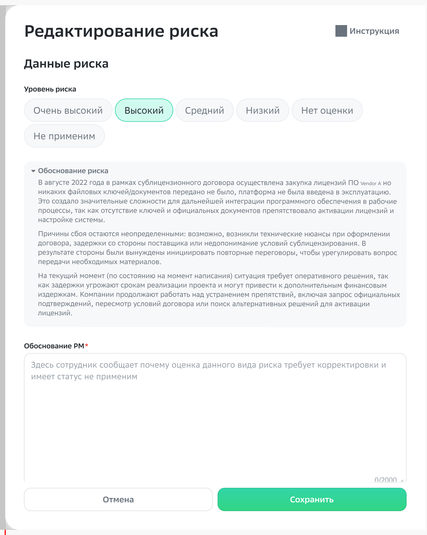
Thirteen risk types unfold for every version, but some of them just don’t apply to a given agent. People sorted this out in email, and a month later nobody could remember why a risk wasn’t assessed. In a regulated process that’s exactly the question someone will ask.
What I did
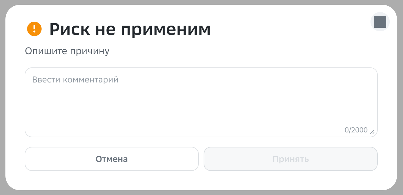
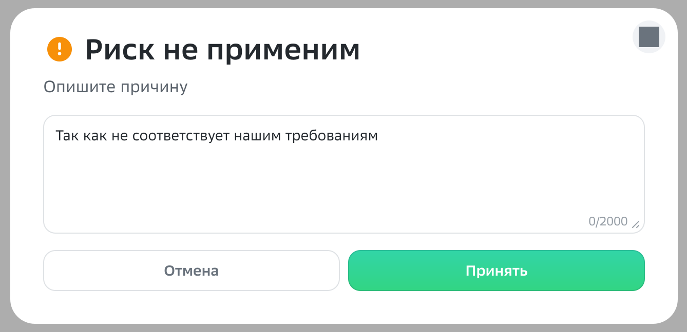
You can mark a risk as not applicable, but only with a written reason: while the field is empty, the “Accept” button stays disabled. A marked risk doesn’t disappear: it stays in the list with its comment and a “Restore” button, and restoring needs an explanation too.
Impact
The reason lives with the risk, not in someone’s inbox. The audit trail builds itself, with no separate “don’t forget to write it down” discipline.
WhyTwo principles at once. Error prevention over error messages: the system won’t let you take an irreversible action without a rationale instead of scolding you afterwards. And reversibility: a marked risk isn’t deleted, it changes state, so the step can always be undone. For a regulated process it’s also an audit requirement: what matters is not only what was decided, but why.
5.6Auto-generating risks from documents
What I found
Writing thirteen rationales from scratch takes hours. Meanwhile a good chunk of what’s needed is already in the documents the person just uploaded: the agent description, business requirements, the codebase.
What I did
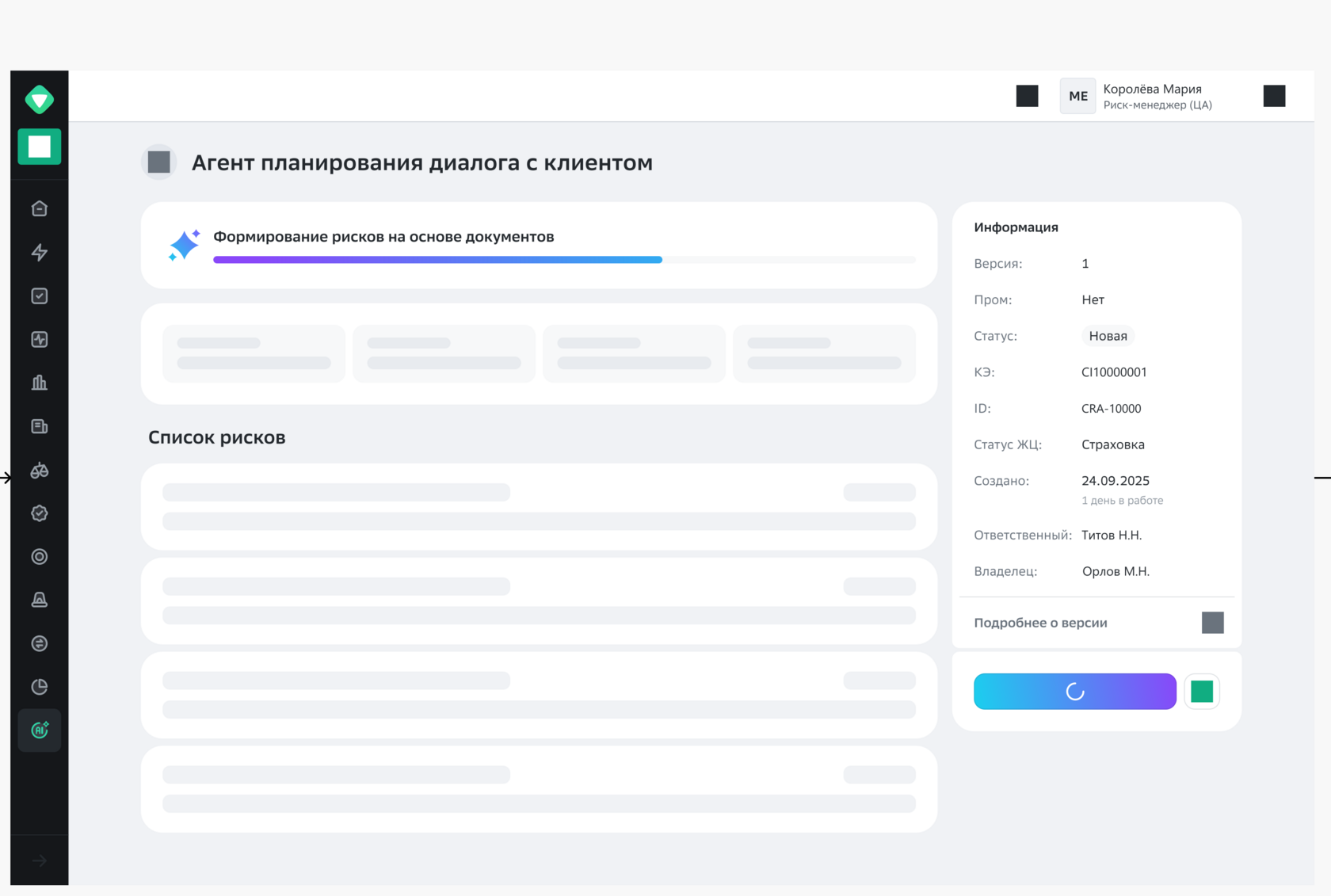
While the system parses the uploaded archive, the screen shows progress and skeletons of the risks to come, so you can see work is happening and how much is left. The empty state before upload isn’t silent either: “you don’t have any assessments yet” plus a hint on what to do next.
Impact
People start not with a blank field but with a draft to check and fix. That’s work at a different price: editing is always faster than writing.
WhyNielsen’s first heuristic, visibility of system status, backed by response-time thresholds: up to 0.1 s feels instant, up to 1 s keeps the train of thought, past 10 s attention wanders. Parsing an archive takes well over ten seconds, so an indicator is a must, otherwise the screen reads as broken. Skeletons instead of a spinner also hint at the shape of the result: the wait doesn’t get shorter, but it gets less anxious.
5.7Protecting unfinished work
What I found
A risk rationale is several paragraphs written slowly and carefully. Losing it to a stray click means losing half an hour of work.
What I did
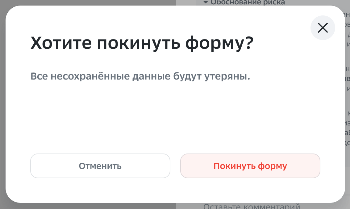
Leaving a form with unsaved edits is caught by a dialog, “Leave the form? All unsaved data will be lost”, with a clear split between “cancel” and “leave”.
Impact
Not a single “I wrote it all and it’s gone”, the most painful kind of loss, the one that makes people start duplicating their work in a notepad.
WhyA confirmation belongs exactly where an action is irreversible and costly; everywhere else it turns into noise people click through without looking. Here the cost of a mistake is high and there’s nothing to restore from, so the dialog earns its place, and the destructive action is labelled with a word, not “OK”.
Risk assessment · filter applied5.2Option 1: applied filters show as chips and can be removed one by one.Risk assessment · sorting5.4Sorting: four options instead of sorting by every field.5.2Filter panel, option 1.5.2Option 2 with a “Show” button.5.5Editing a risk.5.5Empty reason, “Accept” button disabled.5.5Reason written, action unlocked.Generating risks from documents5.6Parsing the archive: progress and skeletons of upcoming risks instead of a spinner.5.7Protecting an unfinished rationale.
06Mistakes and fixing them
What I planned wrong and how I got out of it
A section most portfolios don’t have, and they should: it shows whether a person can spot their own mistake before others do. The breakdowns below are honest, with consequences and no heroic ending.
Mistake 01
I started designing top-down
What I decided
Go from general to specific: registry first, then the agent card, then the risk list, and a single risk last. Familiar logic: the scope is clearer from the top, and details can be picked up along the way.
What went wrong
The bottom level turned out to be not a detail but the source of the rules. When I got to a single risk, states popped up that the upper screens hadn’t accounted for: a risk can be not applicable, it can be partially ready, and four departments assess it at different times. The registry, designed without knowing this, showed states that don’t exist in real life, and had to be redone.
How I got out
I stopped and rebuilt the hierarchy bottom-up: first I described the full life of one risk, with all its states and transitions, and only then assembled the list, the card and the registry from it. After that the upper screens came together with almost no arguments, because they had nothing extra left to show.
What I changed in my approach
In nested systems I now start at the lowest data level, with the entity the work revolves around. It sets the vocabulary of states, and everything above is just ways of showing it.
Hence the order in the decomposition tree in section 02. It looks obvious because it was written down after the fact.
Mistake 02
I treated assessment as one person’s action
What I decided
Design assessment as the risk manager’s job: open the version, go through the risks, set levels, send for approval. I saw approval as a single final button.
What went wrong
There turned out to be four approvers, and they’re not in sync: one department answers quickly, another sits on a risk for a week. In my model a version could only be “in assessment” or “approved”, while in real life it’s almost always half one and half the other. The interface couldn’t show the state the system is in most of the time.
How I got out
I split assessment into two things: each department’s opinion on its own, and the integrated score calculated from them. Intermediate statuses and correction appeared, and the card now shows a visible “no assessment” for departments that haven’t replied yet. Waiting stopped being invisible.
What I changed in my approach
Before mock-ups, I map who touches the object and when. Not roles in isolation, but the actual sequence of touches: it almost always uncovers intermediate states nobody mentions in interviews because they seem obvious.
The most expensive of the three: it rewrote not a screen but the data model.
Mistake 03
I took both filter options all the way to finished mock-ups
What I decided
Build two full filter options, one with auto-apply and one with a “Show” button, and present them side by side so the choice would be deliberate, not accidental.
What went wrong
The question that separates these options could be answered without mock-ups. It sounds like “how much does one query to the results cost”, and it’s a question for engineering, not users. I could have got the answer in one conversation, but got it only after drawing the second option in full.
How I got out
We picked option 1 based on query cost: results come back fast, so people are better off seeing the outcome of each step. The second one stayed in the ideas backlog; it’ll come in handy if the number of filters grows noticeably or queries get more expensive.
What I changed in my approach
Before drawing an alternative, I look for the question that decides between them and check whether it can be answered more cheaply. Often the fork isn’t a design one but a technical one, and then the second mock-up isn’t insurance, it’s a wasted sprint.
Here I have proof beyond memory: both options sit on the working board, the second one labelled “for ideas and future work”. I don’t rewrite history after the fact.
07Outcome
What changed and how it’s measured
The outcomes are written as a formula: what I achieved, how it’s measured and what I did to get there. The format is uncomfortable in a good way. If there’s no clear link between a decision and its effect, it shows immediately, and the number has to be either backed up or dropped.
Outcome 01
X · what I achieved
Six manual handoffs in the route → zero
Y · how it’s measured
Number of handoffs on the process map: six in the “before” route, zero in “after”. The map was built from tracker tasks and checked with stakeholders.
Z · how
Document upload and the draft risk generation moved inside the product, and the go-between administrator dropped out of the chain.
Outcome 02
X · what I achieved
Data prep is no longer a human’s job
Y · how it’s measured
Prep steps before the first assessed row: four steps of twenty minutes or more versus one upload screen.
Z · how
Auto-generation of thirteen risks from uploaded documents, plus the version passport in the same card.
Outcome 03
X · what I achieved
Version status visible without asking
Y · how it’s measured
Answering “what stage is the assessment at” no longer takes an email: the version state reads right in the registry and the card.
Z · how
An explicit version lifecycle, separate opinions from the four departments and a summary above the list.
13risk types per versionFrom prompt injections to an AI platform outage. Each one unfolds for every agent version.
4departments give an opinionEach looks at risk from its own angle and at its own pace. Rolling them into one score is half the job.
6→ 0manual handoffs in the routeThat’s how many times work changed hands before the assessment itself even started.
20min or morecost of each handoff stepAnd that’s active work only. Waiting between steps comes on top.
My personal contribution
I was the only product designer on this project: discovery, the process map, information architecture, every screen and state, defending decisions in front of stakeholders. Three decisions I own personally led to the outcome. First, spending the start of the project on a process map instead of screens: without it the six handoffs would have stayed invisible, because each one looks harmless on its own. Second, separating the four departments’ opinions from the integrated score: that rewrote the data model and made intermediate states possible. Third, moving document upload inside the product, which is what removed the go-between from the chain.
Straight talk about the numbers. Real and confirmed: thirteen risk types, four approving departments, six steps in the condensed old route, twenty-plus minutes per step, two registries and the set of screens. The numbers on the screenshots themselves (639 agents, 142 assessed and so on) are demo data in the mock-up, not production figures, and they’re not claimed here as results. The wording of effects and findings was reconstructed over the course of the project and marked in the page code with an “estimate” comment; when I walk through the case, I talk about them as a reconstruction, not as measurements.
08What I set up for next steps
Where the system grew next
Speed
Fast-track assessment
A separate route for agents where the full procedure is overkill: same system, shorter path. The task was already in the sprint backlog.
Honesty
Flagging AI-generated risks
If a model drafted a risk, the person approving it should be able to see that. A product that assesses AI risks has to be honest about its own AI.
Scale
Search and sorting by planned dates
Once assessments number in the thousands, the summary and filters won’t be enough: you’ll need search in the list and a queue by deadline.
What I took away
The big lesson of this domain: in enterprise, the pain is almost never on the screen. It’s in the seams between people, and you can only see it with a process map, not by chatting about what the interface is missing. Ask a risk manager what to improve and you’ll hear about a button. Count the handoffs in their route and you’ll see the button has nothing to do with it.
What I’d do differently today: go to engineering earlier. Two of my three mistakes cost sprints, and both could have been settled by a question asked before the mock-ups, not after. And I’d start from the bottom data level right away, without testing on myself what happens the other way round.